Moog 60HP Eurorack update
One of the first lessons I learned in consumer electronics is that version 1.0 is the “can we?” release. Version 2.0 is effectively a do-over of 1.0, where we fix all the obvious problems we didn’t fix and the new obvious problems we didn’t predict. Design school has their own version that boils down to “iterate, iterate, iterate!”
So, here are some issues and fixes for -0002.
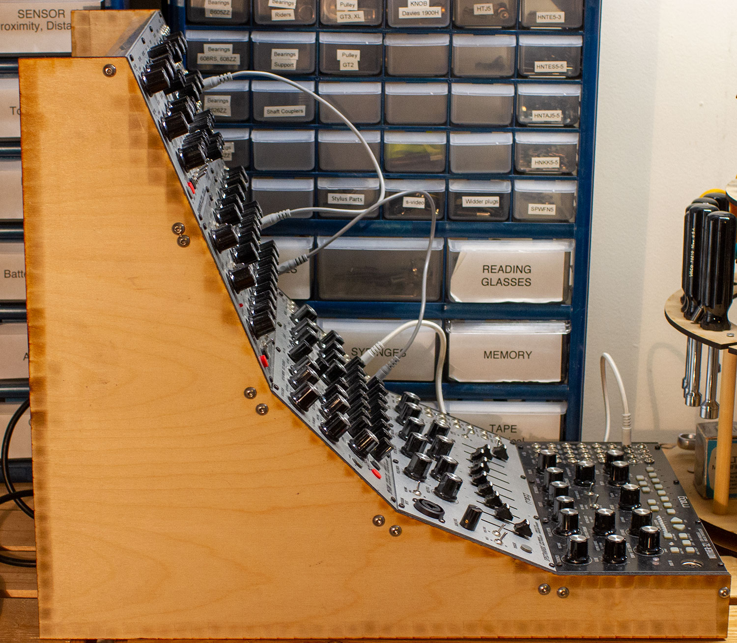
There’s no easy way to support non-Eurorack equipment. The Werkstatt, like the Minitaur, has too many connections in the back of the unit and no easy path to make connections for power, inputs, and outputs. There’s really no easy fix for this other than reskinning the synth. I could have put the Werkstatt on the top panel but that’s an inconvenient location to use the note keys and it still needs a second power supply. It’s easier to just swap it with a Mother-32 which is very Eurorack friendly.
Moog units use a lot more power at startup than they do while running, which is true of plenty of consumer electronic devices. This isn’t something you notice using the wall-wart power supplies, one per synth, but putting all five on Eurorack PSU did not go well. I’m a big fan of Synthrotek Case Power and the maths say that a “Blue” model would have plenty of power for my five units which draw only about 1.5amps. Except at boot time they draw a lot more and the Case Power goes to blinky limbo. Jeff at Synthrotek helped me sort out a solution — switch to the Noise Filtering Power Distribution Board and a beefier PSU. I’m running a Meanwell RT-65B and things boot/run as expected.
The planar panels didn’t work as well as I thought they would. I thought that following the curve of vision as we raise and lower our head was the right answer, and it would be if this rack was 36″ high and the base was at waist height. I put a Mother-32 on the bottom and it’s pretty usable looking down, especially when I’m sequencing and wanting easy access to all the knobs. The top, vertical, panel is not as easy to use as I expected. Yes, vertical is good and in the curve, but the vertical panel is maybe 45 degrees down from my line of sight and it’s hard to read the labels on the controls and jacks at that angle. There’s also some illumination problems, the vertical panel casts a lot of shadow on itself which I find distracting. A lot of my lighting in the studio is top down and does not work with this rack.
Two of the three issues are unrelated to design, easily fixed in-the-shell. The vertical panel really bothered me when I was standing at the bench, I moved the rack to where I normally make music and usability just got worse. Looking at the panels from different positions (standing and seated) the fix was pretty obvious and suggests that maybe I should adjust the angles of other panels. Time to do more use testing.